Last year, my photographer-pastor-friend Lois and I had such a great time collaborating on my Sacred Pauses daybook 2015 that we decided to team up again, this time to make a creative contemplative journal.
What does it mean to live creatively and contemplatively?
For Lois, it might mean wandering around the local reservoir with her camera, or playing with words and images late at night. For me, it might mean using coloured pens to write in my journal, or composing an early morning blog post on Scripture and prayer.
What does living creatively and contemplatively mean to you?
my creative, contemplative journal invites you to explore this question for yourself–with striking full-colour photographs, inspiring quotes, and plenty of room to make the journal your own.
- Turn any blank page into a weekly planner by adding columns for the days of the week;
- Track your own project through the creative stages in this book, from becoming Open to finding Focus and Joy;
- Examine a photo, ponder a quote, sketch out an idea, write a poem, create a mind map, design a recipe, make a gratitude list, compose a psalm or prayer; use as a journal in any way you choose;
- Go beyond these pages and get out for a walk, take your own photos, paint a dream, dance your heart out, live contemplatively and creatively every day.
I’m excited about the possibilities!
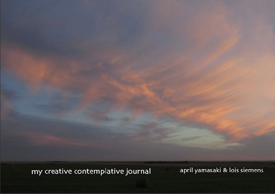
While we’re still working out pricing and other details, we wanted to invite you into our creative process by sharing some possible covers below. We’ve actually considered more than these five image options, and the font size, style, and positioning may all be adjusted–it’s fun to play with different covers! Can you help us decide? Which is your favourite?
Cover A
Cover B
Cover C
Cover D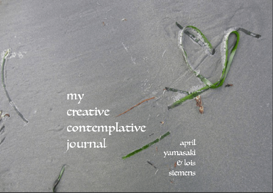
Cover E
Can you help us decide? Which is your favourite?


Please leave a comment: